Color Theory | Eight Artists
11/04/2020 Prints & Multiples
NEW YORK, NY -- Color theory has been a topic of interest among scientists, artists and the general public for centuries. Early references appear in the writings of Leonard da Vinci, and in 1665 Sir Isaac Newton published a rudimentary color circle that attempted to show the relationship between primary, secondary and tertiary colors. Newton expanded on some of his ideas when, in 1704, he documented that light was made of different colors. Color theory developed further in the 19th century to incorporate aesthetic and psychological principles. These in turn influenced technology, design, and art.
Entire movements in art history have devoted themselves to the study of color. Artists like Wassily Kandinsky, Piet Mondrian, Henri Matisse and more contributed to the field through their experimentations with warm and cool palettes, complementary colors and more.
Read on to learn more about how artists form unique relationships to color, exemplified by works from the upcoming Prints & Multiples auction on November 11.
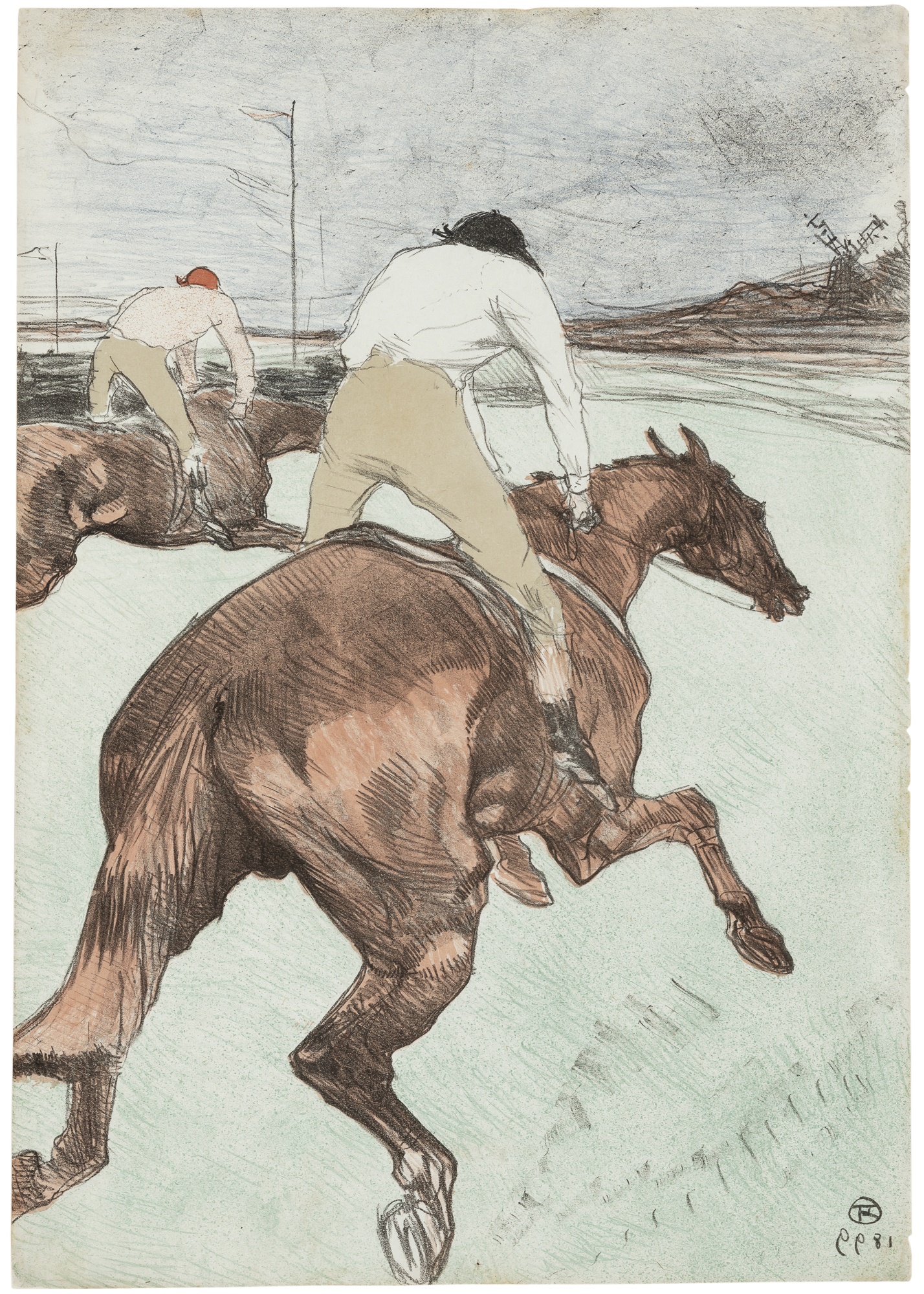 Henri de Toulouse-Lautrec
Well-known for his posters and prints, Henri de Toulouse-Lautrec’s style was heavily influenced by Japanese ukiyo-e prints. As such, he often used large areas of flat color bound by strong outlines and silhouettes to recreate the effect of these works.
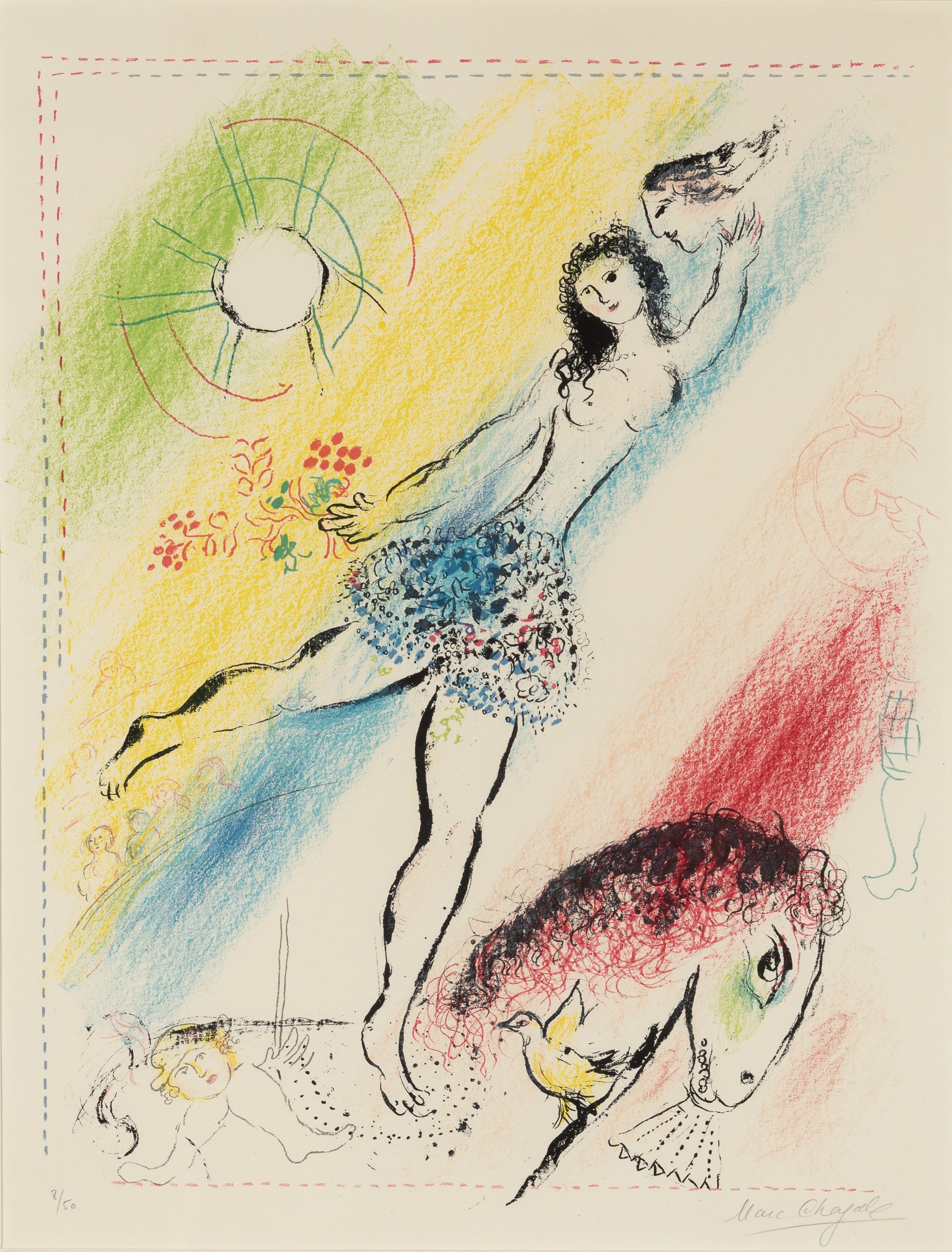 Marc Chagall
“When Matisse dies,” said Pablo Picasso to Francoise Gilot, “Chagall will be the only painter left who understands what color really is.” Indeed, Marc Chagall experimented with a range of palettes in his works. Already ripe with symbolism, his works make the most of his heightened use of color.
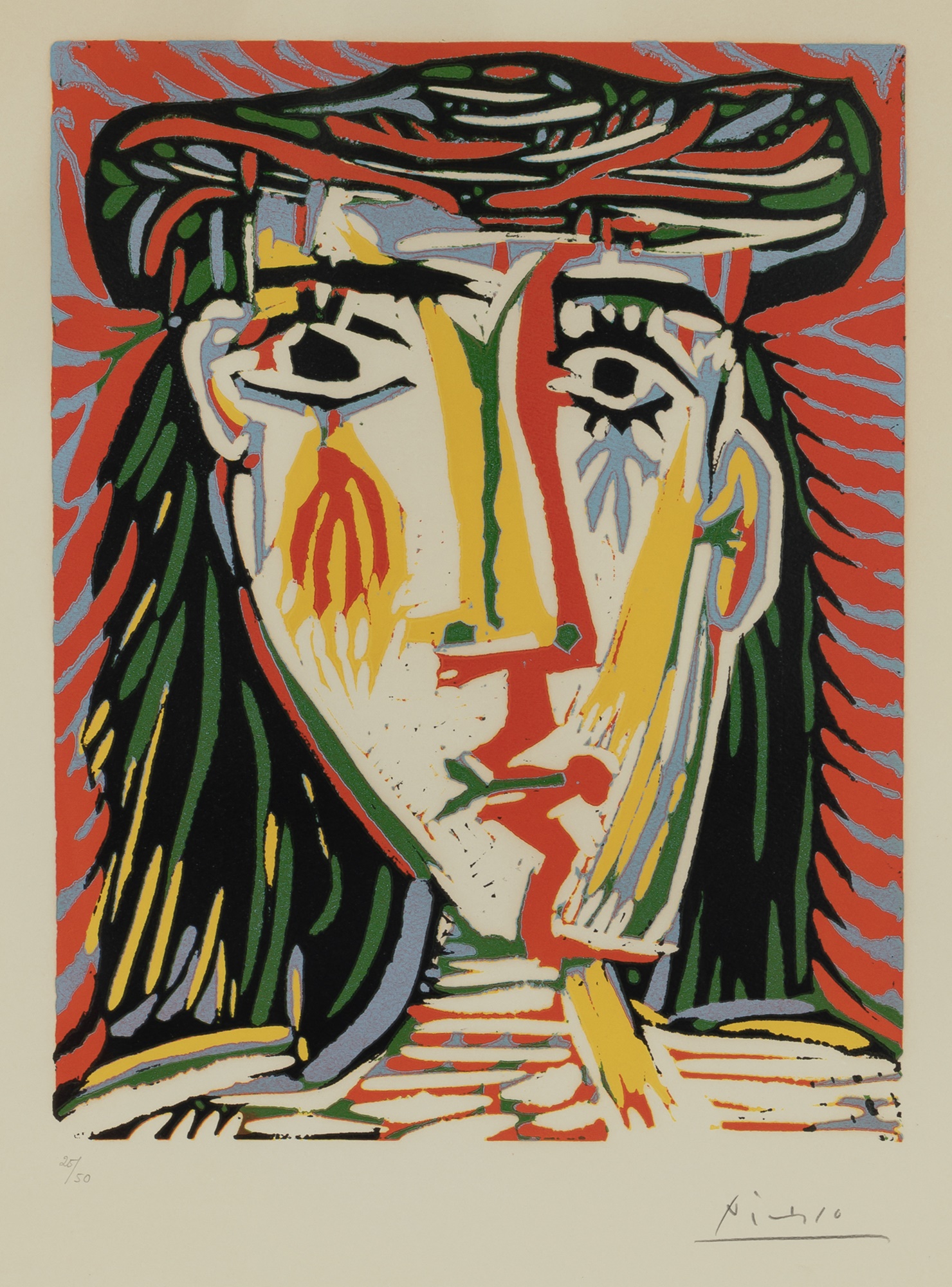 Pablo Picasso
Pablo Picasso had a very famous relationship with certain colors. Well-known for adopting certain pigments during periods of his career, the artist used these hues to express how he was feeling at the time. “Colors, like features, follow the changes of emotions,” he said in the 1930s.
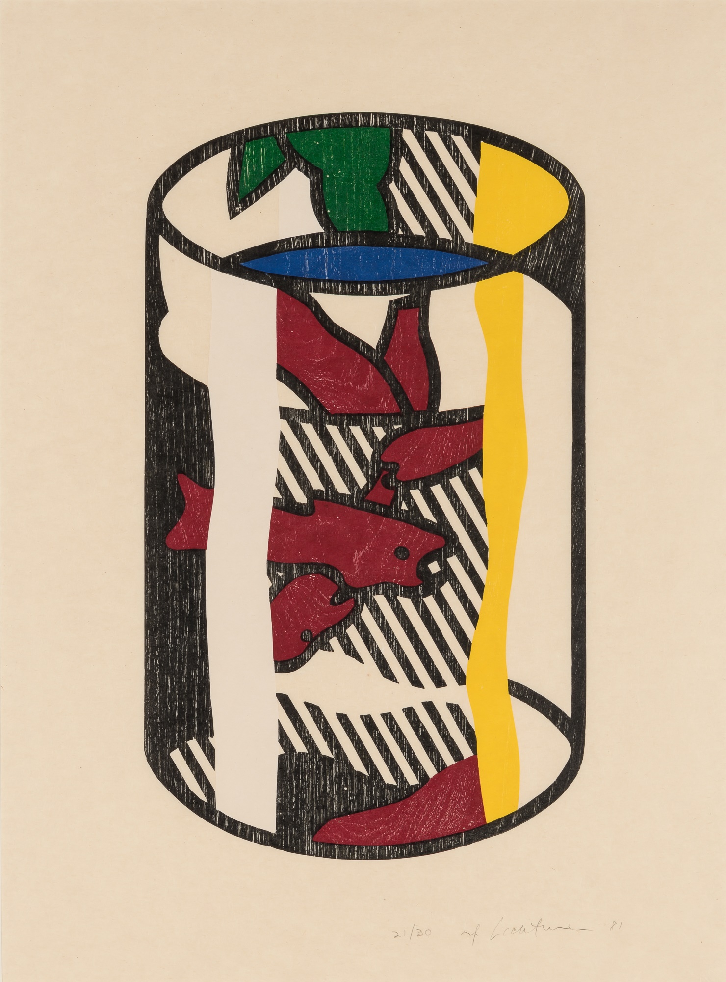 Roy Lichtenstein
Pop artist Roy Lichtenstein is well-known for his cartoon strip aesthetic. A critical component to the success of his output is his careful consideration of color. Lichtenstein used a primary palette, selecting hues that imitated the four colors of printers’ ink used to create comics.
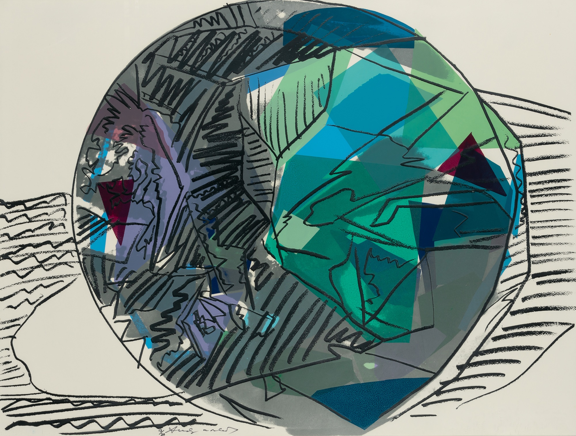 Andy Warhol
Andy Warhol gravitated toward a bright, bold palette -- using colors like red, black, yellow, white, blue, purple and green. He was fascinated by the brain’s ability to process and perceive color, as well as how certain hues could be used to codify messages or data. These ideas were grounded in the theories of American color psychologist and art historian Faber Birren.
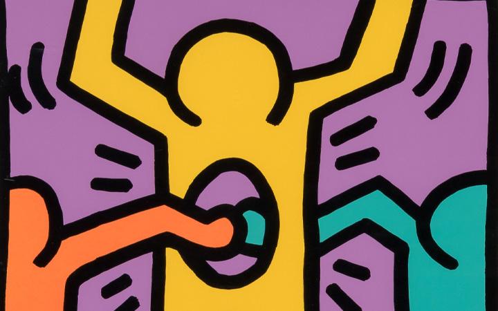
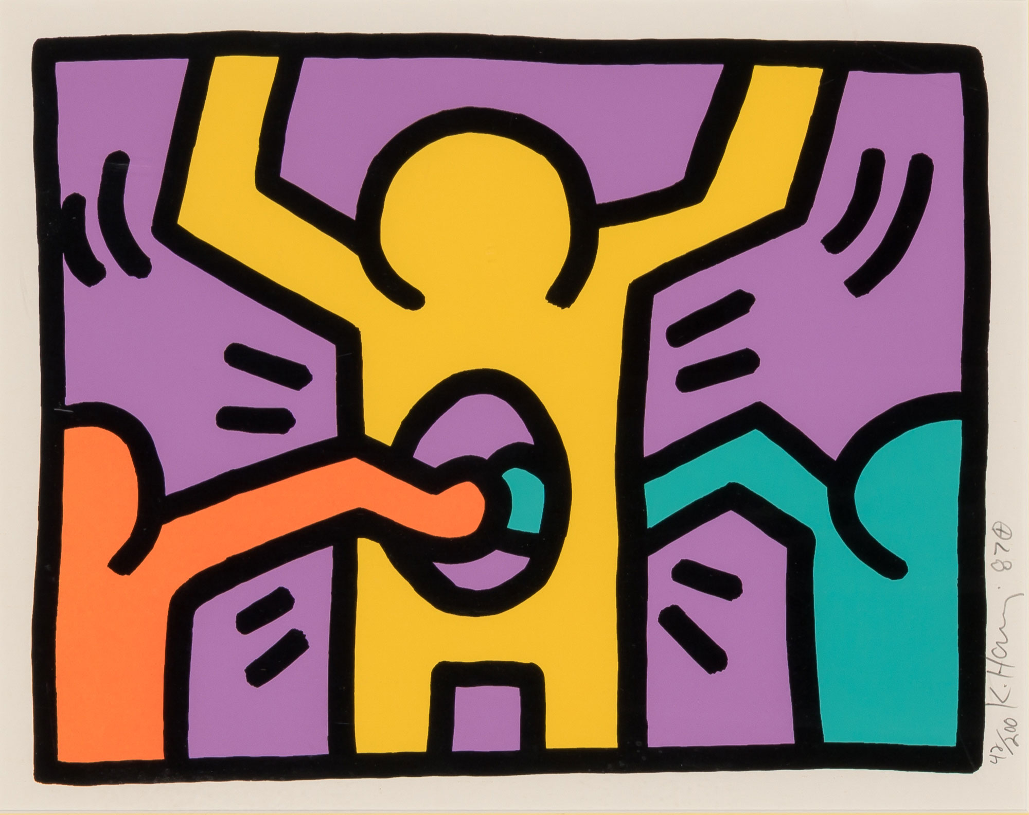 Keith Haring
“Clearly, [Keith] Haring sought to startle with his use of color,” said the artist’s former studio manager Julia Gruen. “The juxtaposition of opposing warm and cool colors creates an electricity -- or charge -- on the surface of the work.” Keith Haring’s fascination with complex patterns, combined with his interest in color, result in the immediately recognizable quality of his work.
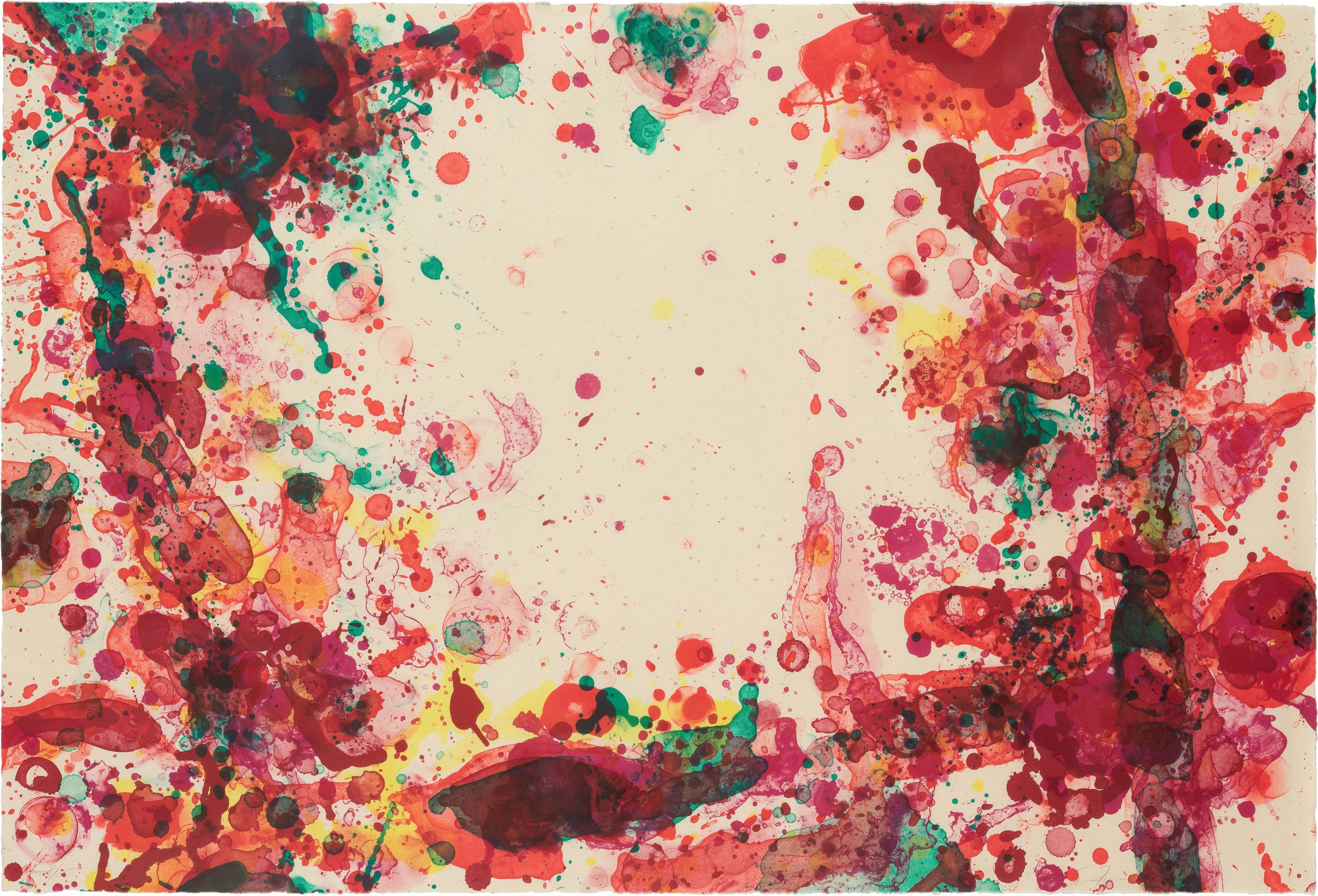 Sam Francis
Sam Francis used highly pigmented, saturated colors that yielded a super-rich tint. He was so particular about his prints that, beginning in 1970, his studio assistant manufactured custom color dispersions and printing inks. Francis was known to, on occasion, use printing inks from his Lithography shop on his canvas paintings. According to Ruth E. Fine, curator of prints at the National Gallery, D.C., “nuance of hue became essential to the character of each individual work.”
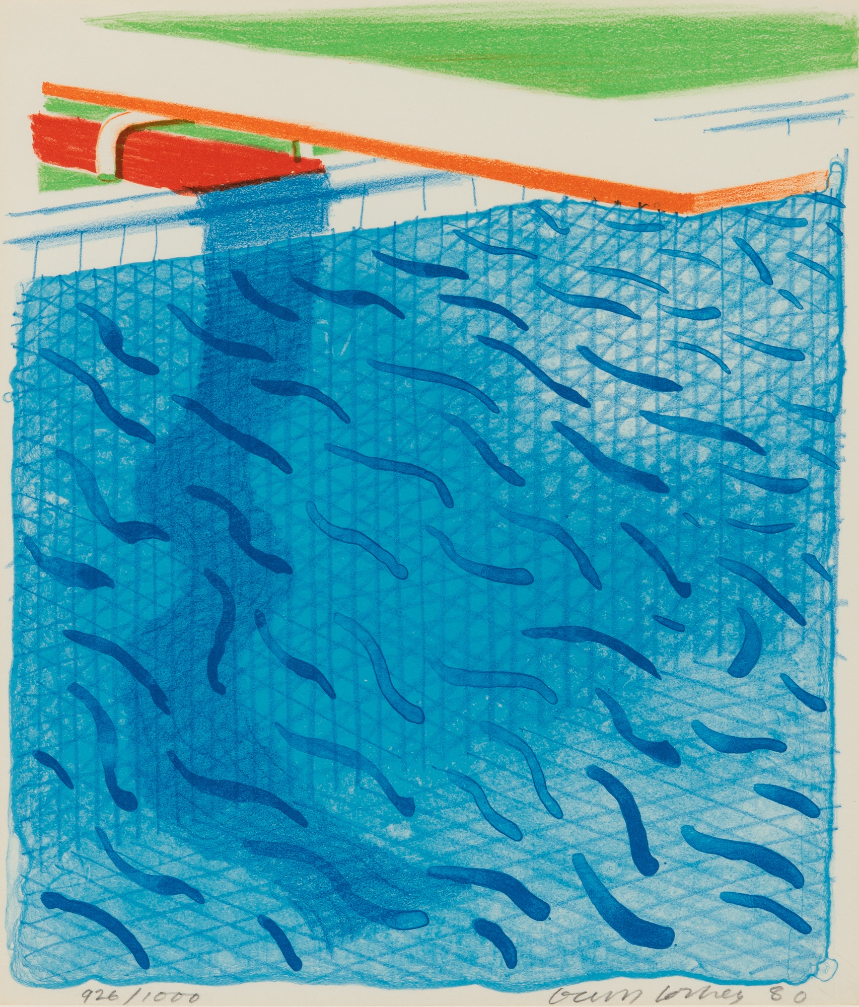 David Hockey
David Hockey first visited California in 1963 and later settled in Los Angeles in 1976. It was during this period that the artist began working from a subject to which he would return for many years in different mediums: the swimming pool. "Water in swimming pools changes its look more than in any other form," he wrote in his 1967 book, David Hockney by David Hockney, "But the look of swimming pools is controllable -- even its color can be manmade...I had to use techniques to represent this. If the water surface is almost still and there is a strong sun, then dancing lines with the colors of the spectrum appear everywhere."
Other links:
https://mymodernmet.com/basic-color-theory/2/
https://www.widewalls.ch/magazine/color-theory-basics-elements-color-wheel
Prints & Multiples
The sale of Prints & Multiples on November 11, 2020 will showcase a fine selection of prints and multiples spanning 17th through the 21st centuries.